HELLO, today i am going to be talking about the principles of ITS(International Typographic style)
found in contemporary logos. i have chosen ten logos and out of the ten i will talk about my favorite five and explain why i chose them and why they have the principles of ITS.
Cartoon Network
Walt Disney

LG( Life's good)
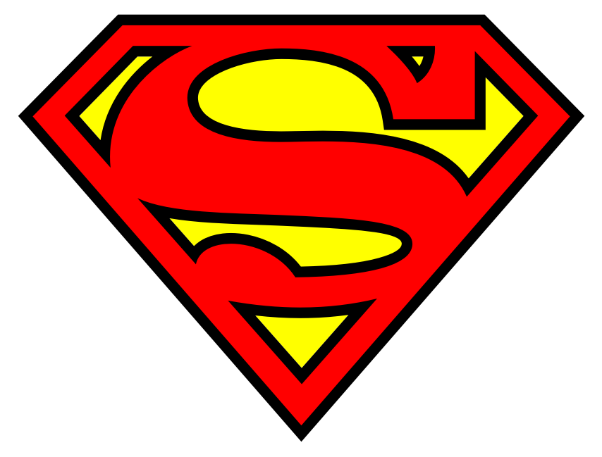
Superman (one of my favorites)
Playstation 3
Coke
Coke is the largest and most
popular cold drink company in the world and like a Visa card it’s pretty much accepted everywhere. The
coke logo is simple and only has two colours, red which is bright and eye
catching, with writing in white which contrasts the red very well, making it
very clear.
It has the properties of ITS (International Typographical System),
as it is clean and clear, very easy to read, objective and asymmetrical in its
design, it’s got a wavy, cursive and fun typographical style which represents
what cocacola is all about, because even in the adverts we see on tv cocacola
is mostly about energy and fun.
The coke logo design has only been slightly
modified since its creation because, quite frankly, it doesn’t need to. It’s
easily one of most recognizable logos in the history of mankind. That’s why I chose
Coca Cola.
Standard Bank
Standard Bank is one of the leading
banks here in South Africa; also have some of the most memorable slogans such
as “Simpler, Better, Faster” and “Moving Forward”. These two slogans basically explain
their mentality and motto. Their logo is a shield with a flag. The shield is a
sign of protection as if they’re saying we’ll protect your money and investments
and that you can trust them.
A flag can symbolise freedom and leadership
which is has a different kind of meaning for a bank. Freedom meaning freedom to
do what you want and need with your money and leadership as in it leads in
terms of other banks and moving forward ahead of the competition.
The colours
are blue and white; it’s a very basic design and gets the point across easily. The
typography is also bold and eye catching with the asymmetrical logo. Like their
logo says it’s simpler, better and faster; as it’s so simple, easy and fast to
understand that they don’t have to say anything else.
Nike
Nike is one of the most popular
clothing brands in the world, especially amongst sport enthusiasts. As it
provides sports gear for a wide variety of sports and sponsors as well as for many
famous athletes around the world like soccer player Lionel Messi. The Nike logo
is very well known and recognisable, known for its simplicity and iconic tick,
which represents its excellence and flare, and its mixture of quality and flashiness.
The style of the logo is simple
and effective; you know exactly what you’re looking at when you see the Nike
tick. Its colour depends on what it’s selling, so pretty much any colour you
can think of. Its logo hasn’t changed since its foundation, it’s asymmetrical
as the tick is curvy and like a ramp always moving upwards and showing
progress.
Much like the company itself, the typography is simple and has a
slight tilt again showing forward movement and evolution.
DC Comics
DC is one of the two big boys of
the comic book world. With known heroes such as Batman, Superman and Wonder
Woman, who are considered to be the holy trinity of the DC Comics. This also
has the elements of ITS, easy to read, very clean, clear and concise,
asymmetrical in design with the smart flip page D.
Their new logo represents
the comic book audience as the ‘D’ in the logo represents someone flipping a
page as if they were reading a comic book.
I love this design because it is
simple in its elegance. The standard logo uses the blue, light blue and white
colours which is standard DC colours for the past few decades. DC changes the
colours of logo to represent the hero of the comic. If its Green Lantern its
green, Batman is black and grey, Watchmen is black, yellow with the iconic
blood spot.
They introduced this new logo last year to go with reboot of the DC
universe and the new 52 comics, to get new readers and provide and easier place
for new readers to start while integrating the comic book history the old
readers enjoy. I chose DC Comics because I love DC comics; Batman and Joker are
my favourite hero and villain. I also enjoy Justice League, Green Lantern and
Flash.
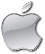
Apple- mac
Apple is one of the biggest and
popular companies in the world, especially in the USA. From the MacBooks,
iPhones, iPads, iPods, iTunes and other ‘i’ named products it has expanded
rapidly in the past decade like crazy becoming a household name worldwide.
The
Apple logo is another simple design, a bitten apple. the apple has had different symbolic meanings
through out history, in the biblical sense of Adam and Eve, symbolising the
original sin, apples have also symbolised love, affection, temptation and
knowledge. It’s easy to digest (pardon
the pun) as everyone knows what an apple is and usually seen as a positive
thing, like the student giving an apple to a teacher they like.
The most recent version of the
logo is silver/platinum (arguable), showing how valuable and prestigious they
are and their level of excellence and achievement. Very few companies know the
success and level of profits and popularity that Apple has shown, especially in
America.
No comments:
Post a Comment