Thursday, 16 May 2013

United Colours of Benetton 80s - Till Now


1984 – Benetton Has All the Colors of the World


1985 – Flags Campaign


1985 – United Contrasts of Benetton

1986 – United Colors of Benetton


1988 – Adam and Eve Campaign


1989 – Contrast in Black and White


1990 – Embraced in Blanket


1991 – War Cemetery


1992 – Olympics Campaign


1992 – Reality Advertising


1993 – AIDS Campaign


 1994 – AIDS Campaign 

1994 – Bosnian Soldier


1995 - Fabrica


1995 – Hermaphrodite


1996 – World Food Summit Campaign


1997 - Portraits Campaign


1999 – Colours of Benetton


2000 – Sentenced to Death


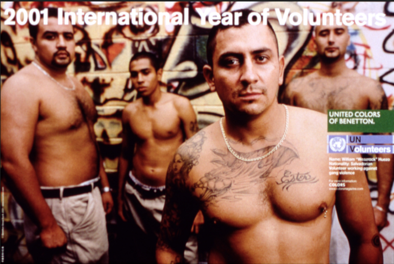
2001 – International Year of Volunteers


2002 – Food for…


2004 – James and other Apes


2008 – Microcredit African Works


2010 – It’s My Time


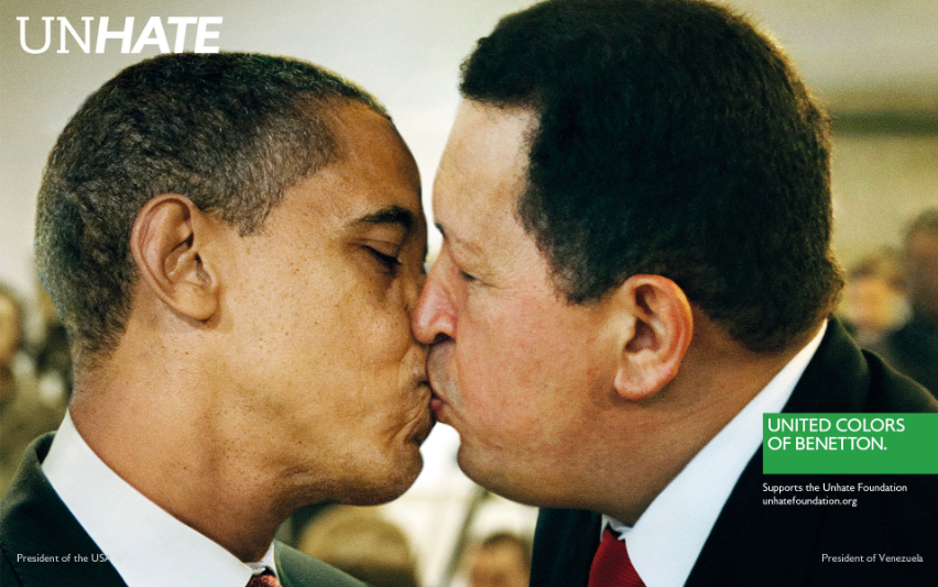
2011 – UnHate Campaign


2012 – Unemployee of the Year


2013 – 9 Personalities, 9 C0lors


http://www.benetton.com
http://www.benettongroup.com/40years-press/40_years_timeline.html
http://pubenstock.wordpress.com/2011/08/08/flashback-la-communication-benetton-de-1984-a-2000-les-annees-toscani/

Pulse


Pulse
When wireless technology puts humans into contact with an unstoppable force that's determined to claim the lives of the living for the souls of the damned, it is up to our group of unwavering protagonist led by Kristen Bell to close the gate before it's too late in director Jim Sonzero's remake of Kiyoshi Kurosawa's apocalyptic horror classic. A doorway between the human realm and the spiritual realm has been opened by the digital realm. Now the technology that once made humankind the ruler of the planet and complacent has become its digital weakness. With every call made and every e-mail checked, life is slowly being stolen from the living and claimed for the dead. With no way of turning off the connection and no means of reasoning with a force they cannot understand, a desperate group of college students must discover a means of stopping the takeover before the entire planet is transformed into a cosmic haunting ground for wayward souls in search of a home.
http://www.rottentomatoes.com/m/pulse/

What Konik is saying about Sonzero’s Pulse (2006)

Technology has expanded the beyond that of human control much like consciously aware Robots and A.I or “The Terminator” movies and “The Matrix” trilogy respectively. The technology impacts the human world causing desensitising and the destruction of social bonds as people do not communicate on personal level as much as they used. Technology is no longer a tool used by humans but is now controls their lives as people are now obsessed with what is the next piece of tech that will consume their lives. We humans have built our lives around technology and its availability. The technology enhances its own power by taking individual life, particularly at a psychological level. The so called “ghosts” signifies the technology that has exceeded human control. There is no natural resistance to technology.

Sunday, 7 April 2013

Comparing Modernism and Postmodernism


MODERNISM
POST MODERNISM
Consistent
Inconsistent
No colour or emotion
Expressive
Clean
Cluttered
Balance
Complicated
Functionality
Unpredictable
Legible
Sampling
Abstract
Eccentric
Utopian
Dystopian
Responsibility
Self-indulgent
Harmony
Nihilism
Form follows function
No particular meaning
Standardised
Engage with design
Symbolic
Juxtapose
 

http://arthistoryresources.net/modernism/roots.html
http://www.cla.purdue.edu/english/theory/postmodernism/

South African Conceptual Design


1) Cancer Association of South Africa (CANSA)

In this campaign the Cancer Association of South Africa (CANSA) is highlighting the issues of skin cancer. They make the observer aware that tanning without UV resistant sunscreen may cause skin cancer and either wise damage your skin. In the case of this campaign that you will turn into an “angel” in other die if you’re not careful and do not take steps to protect yourself. The picture shows a young lady making a sand angel with her eyes closed signifying she is or soon will not be with us anymore with a warning about skin cancer and using protection against UV light.

2) The South African National Council on Alcoholism and Drug Dependence (SANCA)

In this campaign the SANCA is highlighting the issues of drinking during pregnancy. They make the observer aware that drinking while pregnant may not have an immediate effect on a newborn baby but will develop as something worse late in life. In the case of this campaign that is life of drug and alcohol abuse which many of these children will enter because of the alcohol consumption by their mothers while pregnant. The SANCA logo is placed within a sonar picture drawing attention to the issue, the issue is further emphasised with the main character in the advertisements lying in environments associated with drugs, curled up in the fetal position.

3) Greenpeace

In this campaign Greenpeace is highlighting the environmental issues concerning our planet namely Global Warning. They make the observer aware that if something does not happen soon that there will not be any snow, snowmen and the memories that come with. The snow has become water due to the heat and all that is left are the clothes drowning in the water. The picture is a snow globe except that everything inside has melted because of Global Warming so it is just a water globe now with a scarf, some buttons and a carrot. All that will be left after the ice melts away.

The Manifesto's


First Things First Manifesto 2000:
http://www.eyemagazine.com/feature/article/first-things-first-manifesto-2000

Incomplete Manifesto for Growth by Bruce Mau:
http://www.brucemaudesign.com/4817/112450/work/incomplete-manifesto-for-growth

I agree with these manifestos, art in all its forms should not be forced to be slaves to advertising, marketing and public relations. It should be unique and up the artists design and imagination. We cannot expand as artists and become better than we are unless we push the boundaries, and only by breaking the boundaries of normalcy will we find originality and in that originality art. Like the First Things First Manifesto 2000 says, we artists should concern ourselves with more important work such as education, charitable causes, community and cultural crises.

Sunday, 10 March 2013

Coca-Cola


Coca-Cola is one of the world’s most valued and best-known brands. Created in Atlanta, Georgia on 8 May 1886, the first Coca-Cola was described as "delicious and refreshing".  Not much has changed since then, and sometimes there’s still nothing better than a Coke to quench your thirst, or to mix another of your “favourite” drinks if you know what I mean.
The Coca-Cola contour bottle, which dates back to 1915, is the most recognised packaging in the world today, with the formula being trade secret. Through the years the Coca-Cola brand has come to mean more than just a drink, achieving celebrity status in many spheres of society featuring commercials with famous people from all over the world. It represents the power of optimism and positive thinking. It is "happiness in a bottle", it connects people and it brings out the best in the human spirit.
Coca-Cola has always had drinks I’ve enjoyed from Fanta, Sprite and of course Coke itself, I also enjoy their smaller brands like Valpre water, Minute maid on airplane rides and the occasional Powerade when I’m tired. Not just their taste though but the designs that have come along with the Coca-Cola brand. It’s always very playful, curvy and attention grabbing. 
Fanta with an attitude of playfulness, humour and fun, for example. This positive imagery is driven by the brand’s fun, playful and wacky personality, which goes hand-in-hand with the bright colours, bold fruit taste and tingly carbonation. In Fanta’s world, fun is guaranteed. This type of fun activity is shown a lot in their marketing and advertising.
The Coca-Cola  is everywhere and they got their foothold in almost every type of drink and events like the Olympics or arenas like South Africa’s very own Coca-Cola Dome, which hosts many events, concerts, expo and conventions. Even energy drinks like Powerplay, Beware the Kick! That’s probably what I like most about Coca-Cola, is that they try to be positive and share their positive message.


Corporate Philosophy
To refresh the world – in mind, body and spirit
To inspire moments of optimism – through our brands and actions
To create value and make a difference everywhere we engage
That’s why Coke is aligned with properties that embody the brand experience. In South Africa, these "feel-good" platforms include football, music, holidays, food and summer. Across a range of media channels, you’ll often hear about the involvement of Coca-Cola in landmark initiatives, like Coca-Cola Football Stars, My Coke Fest, Coke & Food, and much more. They also declare their values on their main website, which include principals such as leadership, passion, innovation and collaboration

Identity
We can see Coca-Cola constantly convey their company values and accomplish their mission statements through various mediums. Part of the reason The Coca-Cola Company is so successful is because their brand identity invades the mind of their consumers by being daring and unique. The look and feel of the brand adopts an energetic and lively tone to reflect the business’s core values, shown above in their philosophy.
A strong brand identity will differentiate you from your competitors. It’s down to branding that convinces a consumer to choose one organisation over the other.  Businesses need to develop their smaller brands (Valpre, Minute Maid, Powerade, PowerPlay), and be less worried with their leading brands (Coke, Fanta, Sprite); there’s only so long that any business can focus purely on this.
By exploiting various platforms to send your brand’s values you will strengthen the perceptions of your business. Visual aspects are part of what keeps a brand powerful and influential, while consistency across multiple channels can lead to a strong reputation. Which leads me to the next topic.

Corporate Image
Coca-Cola has used emotional design to make their stand look refreshing and exciting, which reflects their mission statement. Coca-Cola isn’t just simply known, the brand is known for the right things like refreshment and inspiration, which they have clearly shown through their iconic design.
If we were to define Coca-Cola ourselves, wouldn’t you agree that there is a sense of togetherness and being united and there seems to be a focus on family, culture, music and happiness. It’s appropriate to say that some of these values and mission messages are firmly shown through their fun and interactive website. It is "happiness in a bottle", it connects people and it brings out the best in the human mind and body.
Coca-Cola is the only brand in the world to have an entire museum that showcases its history, current reality and future possibility. The New World of Coca-Cola in Atlanta is open to the public and is a must see if you are ever in that city.


Changing Brand Strategy/Image
A company as vast as Coca-Cola should always listen to consumers and their demand and never feel comfortable at the top. The recent news is to change or even discontinue the Sprite brand all together. No one I know wants this to happen and there are already petitions on Facebook and other social networks to stop this from happening. If your consumers aren’t satisfied they’ll let you know or move on to something better, simple as that.
Critics often give Coca-Cola grief about health issues so my suggestion is to advertise the fact they do have healthy alternatives to their leading brands like Coke, Sprite and Fanta. Coca-Cola also has Valpre, Minute Maid, Nestea and Vitamin Water. Most people don’t know or realise that these are all Coke brands.

Saturday, 23 February 2013

One Small Seed


The magazine I’m researching is the One Small Seed, South Africa’s pop culture platform. One Small Seed informs, advertises, shows and promotes many forms of art and culture. From photography, architecture and music to graphic and fashion design.

The layout, menus and grid structure are very well organized. The use of images makes it easy to navigate the website, even though it was the first time I went on the website I never got lost or confused, and I knew exactly where to go. It’s very simple and user friendly making sure anyone can navigate it. Many pictures and photographs relating to the articles you want to read and to the genres you want to check out. There's also a search engine in case you’re looking for something specific in the website.

They’re using a black Helvetica font on a white background making it easy to read and understand. The headlines and story headings are in caps so it catches your eye so you don’t miss any story, articles, photos and styles you want to know about.


The content is very varied, unique, recent and well written. If you love the art lifestyle you’ll find what you’re looking for on this website. From music, art, conventions, photography to the latest events, news and new people coming up in the field or reviews, interviews and whatever you want to know about the culture and the lifestyle of the art world. For example it gives news of the current events from animations, to Skrillex touring South Africa and latest photography albums and styles.


It has used a simplistic style approach to the website, using imagery, simple fonts, easy navigation systems and the most current information and content they can find relating to South Africa. Images on the left with information on the article to the right of the picture, with information saying who wrote the article, when it was written and how many comments there are, and of course the headline of the story in caps and larger text.


There are many genre’s on the website including; architecture, photography, culture, lifestyle, design, photography, events, interviews and reviews of the art world and pop culture. There are many articles and stories on different music genres and its artists like The Ratrod Cats, Th’ Damned Crows and The Vodun Haunts, even Skrillex and Soul music.

Which falls right into who and what the market is. The people that follow the latest trends in photography, art and design or just fans looking for inspiration, motivations and new perspectives for their own work. The market is big, even for the niche interests like electric music festivals, 50’s revival, digital short videos, tips on how to random things like 3d art and design and many many different photography and art style from vast amounts of artists. Each so unique, special and different that it can only be viewed as part of the niche market.